Complete guide for Time series Visualization
Exploring Time series with visualization and identify neccessary trend, seasonality, cyclic in order to prepare for time series forecast
When visualizing time series data, there are several things to be set in mind:
- Although we use the same plotting technique as for non-time-series one, but it will not work with the same implication. Reshaped data (aka lag, difference extraction, downsampling, upsampling, etc) is essential.
- It is informative to confirm the trend, seasonality, cyclic pattern as well as correlation among the series itself (Self-correlation/Autocorrelation) and the series with other series.
- Watch out for the Spurious correlation: high correlation is always a trap rather than a prize for data scientist. Many remarks this as correlation-causation trap . If you observe a trending and/or seasonal time-series, be careful with the correlation. Check if the data is a cummulative sum or not. If it is, spurious correlation is more apt to appear.
The below example with plots will give more details on this.
1. Time series patterns
Time series can be describe as the combination of 3 terms: Trend, Seasonality and Cyclic.
Trend is the changeing direction of the series. Seasonality occurs when there is a seasonal factor is seen in the series. Cyclic is similar with Seasonality in term of the repeating cycle of a similar pattern but differs in term of the length nd frequency of the pattern.
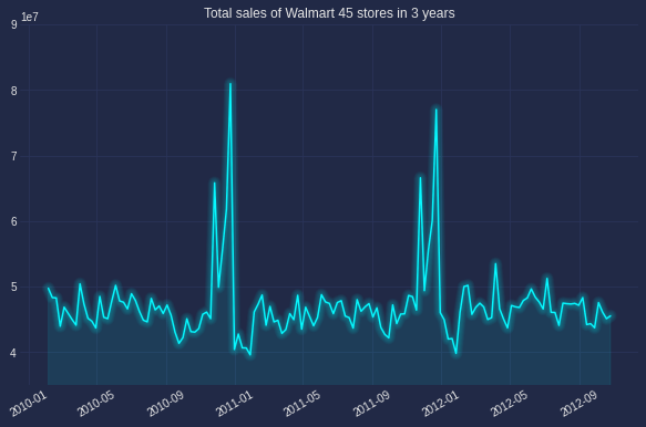
The below graph was plot simply with plot function of matplotlib, one of the most common way to observe the series’ trend, seasonality or cyclic.

Looking at the example figure, there is no trend but there is a clear annual seasonlity occured in December. No cyclic as there is no pattern with frequency longer than 1 year.
2. Confirming seasonality
There are several ways to confirm the seasonlity. Below, I list down vizualization approaches (which is prefered by non-technical people).
Seasonal plot:
This gives a better prove to spot seasonality, spike and drop. As seen in the below chart, there is a large jump in December, followed by a drop in January.
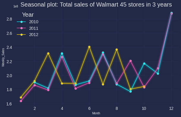
Code can be found below (I am using the new Cyberpunk of Matplotlib, can be found here with heptic neon color)
colors = ['#08F7FE',  # teal/cyan
          '#FE53BB',  # pink
          '#F5D300'] # matrix green
plt.figure(figsize=(10,6))
w =data.groupby(['Year','Month'])['Weekly_Sales'].sum().reset_index()
sns.lineplot("Month", "Weekly_Sales", data=w, hue='Year', palette=colors,marker='o', legend=False)
mplcyberpunk.make_lines_glow()
plt.title('Seasonal plot: Total sales of Walmart 45 stores in 3 years',fontsize=20 )
plt.legend(title='Year', loc='upper left', labels=['2010', '2011','2012'],fontsize='x-large', title_fontsize='20')
plt.xticks(fontsize=14)
plt.yticks(fontsize=14);
Seasonal subseries plot
Next is an another way of showing the distribution of time-series data in each month. Insteading of using histogram (which I considered difficult to understand the insight in time series), I generated box plot.
Of note, the main purpose of this plot is to show the values changing from one month to another as well as how the value distributed within each month.
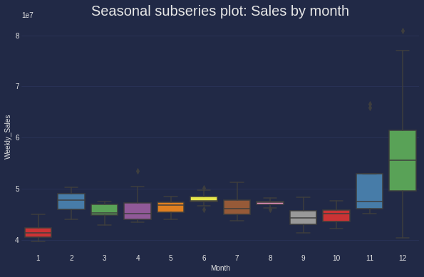
Box plot is strongly recommended in case of confirming the mean, median of the seasonal period comparing to other periods.
3. Correlation
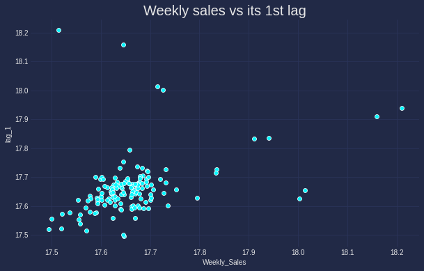
Alike other type of data, Scatter plot stands as the first choice for identifying the correlation between different time series. This is especially the case if one series can be used to explain another series. Below is the correlation of sales and its lag 1.
data_lag = data.copy()
data_lag['lag_1'] = data['Weekly_Sales'].shift(1) # Create lag 1 feature
data_lag.dropna(inplace=True)

plt.style.use("cyberpunk")
plt.figure(figsize=(10,6))
sns.scatterplot(np.log(data_lag.Weekly_Sales), np.log(data_lag.lag_1), data =data_lag)
mplcyberpunk.make_lines_glow()
plt.title('Weekly sales vs its 1st lag',fontsize=20 );
It is apparant that the correlation between the original data and its 1st lag is not too strong and there seems some outlier in the top left of the graph.
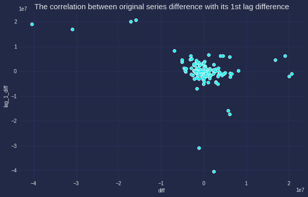
It is also interesting to identify if this correlation actually exists and can we use lag 1 to predict the original series. The correlation between the original difference and the 1st lag difference will give proof for hypothesis.
data_lag['lag_1_diff'] = data_lag['lag_1'].diff() # Create lag 1 difference feature
data_lag['diff'] = data_lag['Weekly_Sales'].diff() # Create difference feature
data_lag.dropna(inplace=True)

plt.style.use("cyberpunk")
plt.figure(figsize=(10,6))
sns.scatterplot(data_lag['diff'], data_lag.lag_1_diff, data =data_lag)
mplcyberpunk.make_lines_glow()
plt.title('The correlation between original series difference with its 1st lag difference',fontsize=15);
Moving average and Original series plot

def plotMovingAverage(series, window, plot_intervals=False, scale=1.96, plot_anomalies=False):

    rolling_mean = series.rolling(window=window).mean()

    plt.figure(figsize=(15,5))
    plt.title("Moving average\n window size = {}".format(window))
    plt.plot(rolling_mean, "g", label="Rolling mean trend")

    # Plot confidence intervals for smoothed values
    if plot_intervals:
        mae = mean_absolute_error(series[window:], rolling_mean[window:])
        deviation = np.std(series[window:] - rolling_mean[window:])
        lower_bond = rolling_mean - (mae + scale * deviation)
        upper_bond = rolling_mean + (mae + scale * deviation)
        plt.plot(upper_bond, "r--", label="Upper Bond / Lower Bond")
        plt.plot(lower_bond, "r--")

        # Having the intervals, find abnormal values
        if plot_anomalies:
            anomalies = pd.DataFrame(index=series.index, columns=series.columns)
            anomalies[series<lower_bond] = series[series<lower_bond]
            anomalies[series>upper_bond] = series[series>upper_bond]
            plt.plot(anomalies, "ro", markersize=10)

    plt.plot(series[window:], label="Actual values")
    plt.legend(loc="upper left")
    plt.grid(True)

plotMovingAverage(series, window, plot_intervals=True, scale=1.96,
                  plot_anomalies=True)
ACF / PACF plots (Autocorrelation / Partial Autocorrelation plots)
First, talking about Autocorrelaltion, by definition,
Autocorrelation implies how data points at different points in time are linearly related to one another.
The blue area represents the distance that is not significant than 0 or the critical region, in orther word, the correlation points that fall beyond this area are significantly different than 0, and these the points needed our attention. This region is same for both ACF and PACF, which denoted as $ \pm 1.96\sqrt{n}$
The details of ACF and PACF plot implication and how to use them for further forecast can be found here
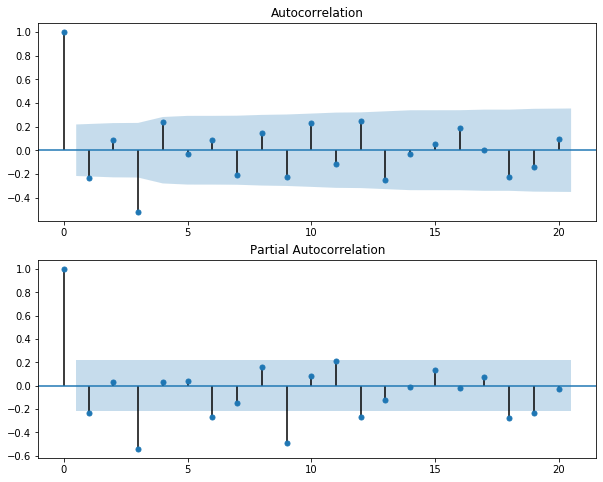
PACF reveals that lag 3, lag 6, lag 9, lag 18 and probably lag 19 are important to the original series
# ACF and PACF for time series data
series=train.dropna()
fig, ax = plt.subplots(2,1, figsize=(10,8))
fig = sm.graphics.tsa.plot_acf(series, lags=None, ax=ax[0])
fig = sm.graphics.tsa.plot_pacf(series, lags=None, ax=ax[1])
plt.show()
Actual vs Predicted values plot
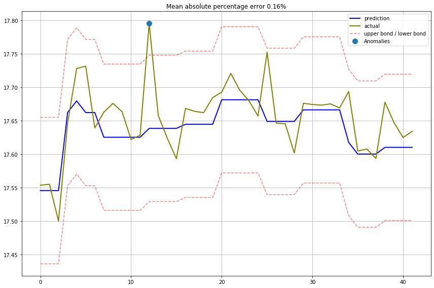
def plotModelResults(model, X_train, X_test, y_train, y_test, plot_intervals=False, plot_anomalies=False):

    prediction = model.predict(X_test)

    plt.figure(figsize=(12, 8))
    plt.plot(prediction, "g", label="prediction", linewidth=2.0, color="blue")
    plt.plot(y_test.values, label="actual", linewidth=2.0, color="olive")

    if plot_intervals:
        cv = cross_val_score(model, X_train, y_train,
                                    cv=tscv,
                                    scoring="neg_mean_absolute_error")
        mae = cv.mean() * (-1)
        deviation = cv.std()

        scale = 1
        lower = prediction - (mae + scale * deviation)
        upper = prediction + (mae + scale * deviation)

        plt.plot(lower, "r--", label="upper bond / lower bond", alpha=0.5)
        plt.plot(upper, "r--", alpha=0.5)

        if plot_anomalies:
            anomalies = np.array([np.NaN]*len(y_test))
            anomalies[y_test<lower] = y_test[y_test<lower]
            anomalies[y_test>upper] = y_test[y_test>upper]
            plt.plot(anomalies, "o", markersize=10, label = "Anomalies")

    error = mean_absolute_percentage_error(y_test,prediction)
    plt.title("Mean absolute percentage error {0:.2f}%".format(error))
    plt.legend(loc="best")
    plt.tight_layout()
    plt.grid(True);

plotModelResults(linear, X_train, X_test, y_train, y_test,
                 plot_intervals=True, plot_anomalies=True)
To be updated
Nhu Hoang
Data Scientist at White Narwhal Japan
Specialized in Recommendation system; Time series; Machine learning and Deep learning. Exploiting is my gut and exploring is my drive.