Useful visualization with source code
Insightful charts to visualize data with Python source code

Useful charts created with Python code
1. Continuous variable with Categorical variable
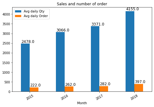
Bar chart
Show trend/values among categorical variables.
This serves best in case of showing the differene between various categories.
ax = data[['x','y']].plot(kind='bar', figsize =(8,5))
positions = (0,1, 2, 3)
ax.set_xticklabels(["2015", "2016", "2017", "2018"], rotation=30)
ax.set_title('Sales and number of order')
for i in ax.patches:
    # get_x pulls left or right; get_height pushes up or down
    ax.text(i.get_x()+.01, i.get_height()+50, \
            str(round((i.get_height()), 2)), fontsize=12);
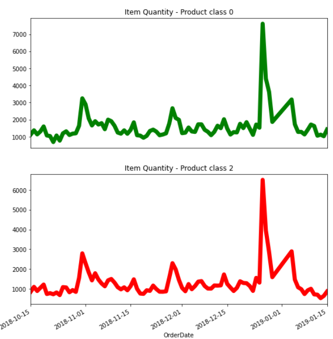
Subplots for multiple categorical variables
Breaking several categories into different subplots will help generating insights, which is related to trend of each category.
plt.figure(figsize=(20,10))
plt.subplot(221)
data[data['type']==0].groupby('Y')['Quantity'].sum().plot(color='green', linewidth=7.0)
plt.title('Item Quantity - Product class 0')
plt.xlabel(xlabel='')
plt.xticks([]) # delete the x axis tick value
plt.subplot(222)
data[data['type']==2].groupby('Y')['Quantity'].sum().plot(color='red',linewidth=7.0)
plt.title('Item Quantity - Product class 2')
# Other subplot can continue with plt.subplot(223) ...
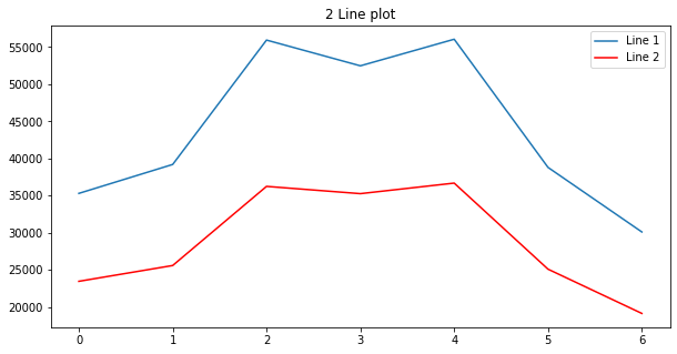
This can also be changed to Mutiple lines plot as below
plt.plot(data['line1'], label='Line 1')
plt.plot(data['line1'], color='red', label='Line 2')
plt.legend()
plt.title('2 Line plot')
plt.show()
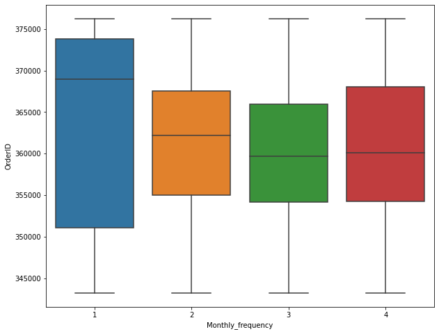
Box plot (distribution box plot)
Talking about distribution, boxplot will initiate many insights, especially when it is used to detect outlier.
fig_dims = (10, 8)
fig, ax = plt.subplots(figsize=fig_dims)
sns.boxplot(x='X', y='Y', data=data)
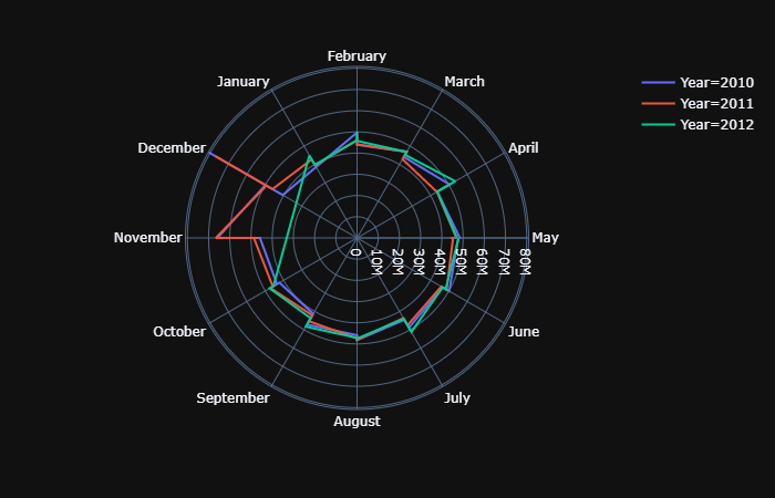
Polar chart
THe below Polar chart used to detech seasonality among 12 months. It is clearly seen that the data at November and December observed spike or in orderword, an annual seasonality.
import plotly.express as px
data['Month'] = data['Date'].dt.month_name()
fig = px.line_polar(data, theta="Month",r="Weekly_Sales",
                    color='Year',
                    line_close=True,template="plotly_dark")
fig.show();
2. Continuous with continuous variables
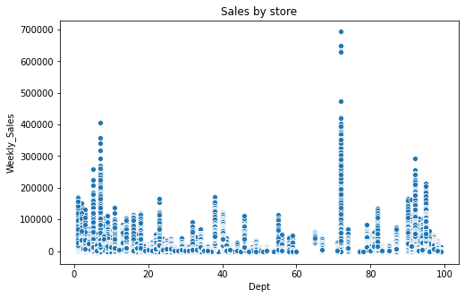
Scatter plot
One of the most popular type of plot to observe the relationship between 2 variables and sometimes help identify the correlation between features. corr function is used to get this correlation.
fig_dims = (8,5)
fig, ax = plt.subplots(figsize=fig_dims)
abc = data.groupby(['A','B','C']).agg({'D':'sum'}).reset_index()
sns.scatterplot(x='C', y='A', hue='B', data=abc, palette="Set2").set(title = 'Order throughout a month');
3. Percentage plot
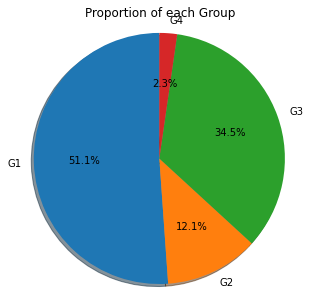
Pie chart
There is a controversy that pie chart can hardly do a good job in representing the percentage. However, if the number of catogories are low, aka below 6, Pie chart proves no problem.
labels = 'G1','G2', 'G3',  'G4'

fig1, ax1 = plt.subplots(figsize=(5,5))
ax1.pie(data.groupby('ProductClass').agg({'ItemID':'count'}), labels=labels, autopct='%1.1f%%',
        shadow=True, startangle=90)
ax1.axis('equal')  # Equal aspect ratio ensures that pie is drawn as a circle.
plt.title('Proportion of each Group')
plt.show();
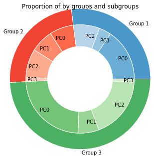
Donut chart (Multiple categorical variables with percentage)
Donut chart is the combination of 2 pie chart, the smaller lies within the bigger. This shows the percentage within of the big group as well as the proportion within each subgroup, which provides a transparent distribution of 2 categorical variables within each other.
subgroup_names = 'PC0','PC1','PC2','PC0','PC1','PC2','PC3','PC0','PC1','PC2','PC3'
labels = 'Group 1','Group 2', 'Group 3'

# Create colors
a, b, c=[plt.cm.Blues, plt.cm.Reds, plt.cm.Greens]
fig, ax = plt.subplots(figsize=(5,5))
ax.axis('equal')
mypie, _ = ax.pie(list(data.groupby(['group']).agg({'Order':'nunique'}).Quantity),
                  radius=1.3, labels=labels, colors=[a(0.6), b(0.6), c(0.6)] , labeldistance=1.05)
plt.setp( mypie, width=0.3, edgecolor='white')

mypie2, _ = ax.pie(list(data.groupby(['group','subgroup']).agg({'Order':'nunique'}).Quantity),
                   radius=1.3-0.3, labels=subgroup_names,
                   labeldistance=0.8, colors=[a(0.5), a(0.4), a(0.3), b(0.5), b(0.4), b(0.3), b(0.2),c(0.5),
                                              c(0.4), c(0.3),c(0.2)])
plt.setp( mypie2, width=0.4, edgecolor='white')
plt.title('Proportion of by groups and subgroups');
4. Change in Order plot
Bump chart
“How the rank changes over time” is the question that is answered by the below graph, called Bump chart
def bumpchart(df, show_rank_axis= True, rank_axis_distance= 1.1,
              ax= None, scatter= False, holes= False,
              line_args= {}, scatter_args= {}, hole_args= {}, number_of_lines=10):

    if ax is None:
        left_yaxis= plt.gca()
    else:
        left_yaxis = ax

    # Creating the right axis.
    right_yaxis = left_yaxis.twinx()

    axes = [left_yaxis, right_yaxis]

    # Creating the far right axis if show_rank_axis is True
    if show_rank_axis:
        far_right_yaxis = left_yaxis.twinx()
        axes.append(far_right_yaxis)

    for col in df.columns:
        y = df[col]
        x = df.index.values
        # Plotting blank points on the right axis/axes
        # so that they line up with the left axis.
        for axis in axes[1:]:
            axis.plot(x, y, alpha= 10)

        left_yaxis.plot(x, y, **line_args, solid_capstyle='round')
        #left_yaxis.annotate(x,xy=(3,1))
        # Adding scatter plots
        if scatter:
            left_yaxis.scatter(x, y, **scatter_args)
            for x,y in zip(x,y):
              plt.annotate(col,
                          (x,y),
                          textcoords="offset points",
                          xytext=(0,10),
                          ha='center')

            #Adding see-through holes
            if holes:
                bg_color = left_yaxis.get_facecolor()
                left_yaxis.scatter(x, y, color= bg_color, **hole_args)

    # Number of lines


    y_ticks = [*range(1, number_of_lines+1)]

    # Configuring the axes so that they line up well.
    for axis in axes:
        axis.invert_yaxis()
        axis.set_yticks(y_ticks)
        axis.set_ylim((number_of_lines + 0.5, 0.5))

    # Sorting the labels to match the ranks.
    left_labels = [*range(1, len(df.iloc[0].index))]
    right_labels = left_labels
    #left_labels = df.iloc[0].sort_values().index
    #right_labels = df.iloc[-1].sort_values().index

    left_yaxis.set_yticklabels(left_labels)
    right_yaxis.set_yticklabels(right_labels)

    # Setting the position of the far right axis so that it doesn't overlap with the right axis
    if show_rank_axis:
        far_right_yaxis.spines["right"].set_position(("axes", rank_axis_distance))

    return axes
5. Other customization
Add x axis tick label
data[['x','y']].plot(kind='bar',figsize =(8,5))
positions = (0,1, 2, 3)
labels = ("2015", "2016", "2017", "2018")
plt.xticks(positions, labels, rotation=0) #Assign x axis tick labels
plt.ylabel('Sales', fontsize =12)
plt.xlabel('')
plt.title('Sales by year');;
Set legend label
plt.legend(['Qty by day in week','# of daily orders'])
To be updated
Nhu Hoang
Data Scientist at White Narwhal Japan
Specialized in Recommendation system; Time series; Machine learning and Deep learning. Exploiting is my gut and exploring is my drive.